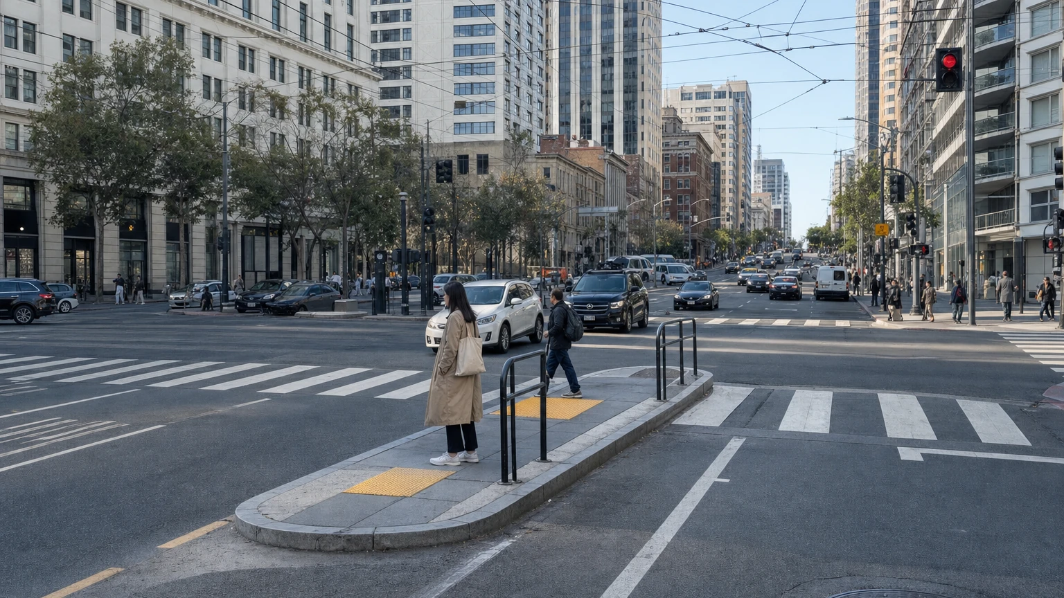
Five people were taken to hospitals Sunday after two vehicles collided near Van Ness Avenue and Ellis Street. The crash looked dramatic: one vehicle hit a fire hydrant and a building, seven people were involved, and five were transported.
But the Fire Department described the transported patients’ injuries as minor. That makes the crash a useful news peg, not one of the fatal or severe-injury events that San Francisco uses to measure its most serious traffic problem.
Hospital transports are not the same as severe injuries
San Francisco’s DataSF collision system separates crashes, parties and victims. One collision can involve several people, and several ambulance transports can still be classified as minor injuries. Conversely, one crash can kill or severely injure multiple people.
That distinction is essential when headlines use the number of people taken to hospitals as a proxy for severity.
Why SF’s High Injury Network is a better map
The city’s current High Injury Network is based on crash data from 2020 through 2024 and combines police collision reports with hospital and EMS information. The final severity determination for matched cases comes from Zuckerberg San Francisco General Hospital.
The result is striking: about 13% of San Francisco streets account for 74% of severe and fatal traffic injuries.
That does not mean every block on the network is equally dangerous, and it does not predict the next crash. It does show that serious harm is geographically concentrated.
13th, Mission and South Van Ness keep appearing
SFMTA identifies the intersections where South Van Ness and Mission meet 13th Street among the city’s highest-collision locations. Public Works’ 13th Street safety project cites roughly 100 injury collisions in its project area over a historical five-year window, with more than a third involving someone walking or bicycling.
Recent 2026 incidents have returned attention to the broader Mission/South Van Ness corridor, including fatal pedestrian crashes and a July collision at 14th and South Van Ness that critically injured two people after an attempted police traffic stop.
The causes of individual crashes differ. The point is not that one intersection “caused” all of them. It is that the same corridor repeatedly appears in both long-run safety analysis and current incidents.
Van Ness is a useful counterexample
Sunday’s crash could make Van Ness look like a worsening corridor. Longer-term data tells a more complicated story. SFMTA’s final evaluation of the Van Ness Bus Rapid Transit project found reported injury collisions fell substantially after the rebuild, including a roughly one-third reduction using its multi-year comparison.
A street can become safer overall and still experience serious-looking crashes. One photograph is not a trend.
Why we are not publishing a fake “Top 10 dangerous intersections” list
Raw crash counts are not the same as risk. A heavily used downtown intersection can have more collisions simply because far more people pass through it. Exposure-adjusted risk would require reliable pedestrian, bicycle and vehicle-volume denominators.
The public police table also is not identical to the hospital-linked severity methodology used for the High Injury Network, and current-year data is updated quarterly rather than in real time.
So the defensible conclusion is more modest and more useful: serious traffic injuries are concentrated, Mission/13th/South Van Ness deserves particular scrutiny, and the first half of 2026 did not improve on the same period of 2025.
What to watch next
The next quarterly release should add July, August and September after city review. That will capture the July South Van Ness crash and, if reported into the injury dataset, Sunday’s Van Ness/Ellis crash. SF News Today will update the analysis rather than freeze a ranking that becomes obsolete.
Related: SF News Today also examined Muni operator fatigue, rest rules and the current Class 9163 pay scale after two fatigue-linked rail incidents.